The Horror of Social Media UX

If you’ve ever tried to post something on social media, you’ve probably had difficulty trying to use the interface. Especially if you tried to post an ad on Meta or LinkedIn. Try choosing a country? Or is it a region? Good luck, have fun.
So what’s wrong? Where does this problem come from? Why do some of the most widely used and ubiquitous web products on the planet have interfaces that are so unintuitive and difficult to use? The problem isn’t just that the interface is difficult to use: it’s incredibly slow. But we all need social media. If you have a public presence, social media is a must.
Still, let’s take a look at some common social media platforms that we all use and see what’s causing us problems and what we can learn from them.
UX issues
What Makes Bad UX Design? As concisely explained by Ramotionan award-winning American design agency:
Any design that doesn’t help users complete their tasks or hinders their progress when interacting with it is an example of bad UX. Whether it overwhelms users or causes multiple errors, poor UX can be detrimental to a product or service.
The simplest way to describe the interfaces of major social media platforms is: overwhelming. It’s cluttered, inconsistent and often confusing. It might not be so noticeable if you’re an average user, but once you delve deeper into the platform for professional purposes, the sheer number of options definitely hampers the user experience.
Later in the text, Ramotion analyzes Amazon Web Services, highlighting the frustrating design of its main navigation. There’s so much going on in the main navigation that it’s hard to find the right information, especially on a device with a smaller screen. Despite the aesthetic design, users may feel overwhelmed and lost.
Similar problems arise on social media platforms such as Facebook or LinkedIn. Facebook is infamous for its cluttered interface and overloaded menus, as well as its frequent design changes that have the power to make the experience even more confusing. In fact, it was a common complaint from 2012 has 2023. LinkedIn is also criticized for its overly complex interface, its unfriendly search functionality, as well as recurring changes to its interface that make orientation difficult.
Additionally, inconsistencies in how features and options are presented across different devices (desktop or mobile) can lead to confusion and a fragmented user experience.
Ultimately, these issues highlight the lack of respect for user-centered design principles, such as simplicity and consistency, which tend to be overlooked in favor of introducing more features and features.
Post an ad on LinkedIn
Let’s take an example of bad UX on social networks: posting an ad on LinkedIn. Just thinking about creating an ad on LinkedIn probably gives you chills. It seems like you have to relearn the interface every time, right?
It’s no exaggeration to say that its Campaign Manager is packed with features. On the one hand, it’s understandable: you need a multitude of features to create and publish the right ad. But there is a problem in the way this information is presented and communicated.
Let’s take a look at how the process works. First, make sure you have the correct account. Next, you need to create a campaign group. However, you probably wanted to create an ad, so if you’re not familiar with LinkedIn’s vernacular, there’s a good chance the terminology is already confusing you.
But once you have your campaign group, you then need to create a campaign. It’s still not an advertisement, but we’re getting there. It’s more understandable.
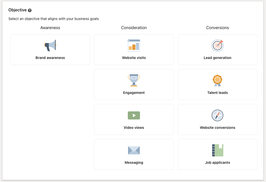
And once you start creating your campaign, that’s your next meeting.

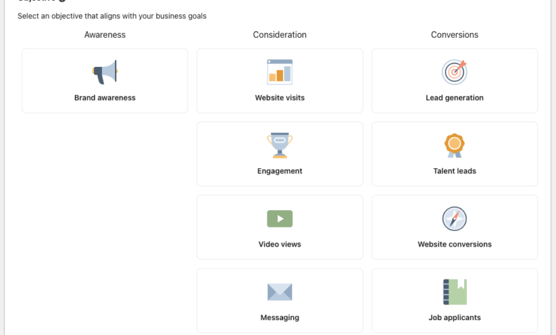
At first glance, it’s as clear as day. You know what you need, don’t you? But what does this mean in practice? What is the difference between choosing website visits and website conversions? How does this change the outcome?
There is an option to click on the small quest dot next to Objective to further explore LinkedIn’s explanation of these options, but nowhere on this page is this information clearly communicated.
The assumption that LinkedIn seems to make is that anyone using this interface understands exactly what they need. But wouldn’t this hypothesis distract less experienced users? What if the user is a small business owner and wants to boost a post about a new product? They may not have a thorough understanding of these terms and may need to do extensive research to determine what they need.
And doing research is great, but it almost feels like LinkedIn is deliberately making the experience more difficult. It’s overwhelming, time-consuming and unnecessarily difficult to manage.
After overcoming this obstacle, new problems arise as you create your ad – this time not because of a lack of information, but because the interface becomes difficult to use. Choosing the right settings for your target audience is an effort in itself. In order to target the right audience, you need to understand the nuances of job titles, company sizes, industries, and more. Other options like cost per click (CPC), cost per impression (CPM), and cost-per-send (CPS) require you to know how each model performs best and which one would work best for your business. campaign.
LinkedIn may want to avoid inconsistent, low-effort ads. But for such a popular platform, conforming to the lowest common denominator of your UX should be a no-brainer. It shouldn’t be so unintuitive, clunky and difficult to navigate, often requiring multiple clicks through different menus until you find what you need.
What can we learn?
If your users are frustrated using your product, you’re doing something wrong.
Social media is complex. There is a certain level of understanding that users may need some time to understand and assimilate the interface, but rather than continuing to complain about the lack of steps being taken to avoid frustration, let’s take this as a learning opportunity.
When creating our Magento stores, we take care to create user experiences that guarantee simplicity, consistency and user-friendliness. Excessive features and poor communication can deter even the most experienced users and complicate the user journey.
A well-designed user experience should facilitate, not hinder, the user’s ability to accomplish their tasks. Adopt these principles to create more effective and satisfying digital interactions.


